Reactで簡単にモーダルが作れるライブラリのインストールと使い方の説明です。今までは自分で一からモーダルを作っていたのですが、今回はライブラリにあやかりました。
前提環境
TypeScriptとReactはインストール済。
インストール
こちらのコマンドを、インストール先のディレクトリで実行。
# npmの場合
npm install --save react-modal @types/react-modal

# yarnの場合
yarn add -D react-modal @types/react-modal

# 補足:@types/react-modalは型定義ファイル
コード
一旦、以下をコピペしてみてください。
開発者がJS版で出していた例を、TypeScript用に私の方でアレンジしました。
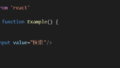
import React, { useState } from 'react'
import Modal from 'react-modal'
const customStyles = {
content: {
top: '50%',
left: '50%',
right: 'auto',
bottom: 'auto',
marginRight: '-50%',
transform: 'translate(-50%, -50%)',
},
}
Modal.setAppElement('#app') // bodyなど任意の要素に変更OK
export const ModalExample: React.FC = () => {
let subtitle: HTMLHeadingElement | null
const [modalIsOpen, setIsOpen] = useState<boolean>(false)
function openModal() {
setIsOpen(true)
}
function afterOpenModal() {
if (subtitle) subtitle.style.color = '#f00'
}
function closeModal() {
setIsOpen(false)
}
return (
<div>
<button onClick={openModal}>Open Modal</button>
<Modal
contentLabel="Example Modal"
isOpen={modalIsOpen}
style={customStyles}
onAfterOpen={afterOpenModal}
onRequestClose={closeModal}
>
<h2 ref={(_subtitle) => (subtitle = _subtitle)}>Hello</h2>
<button onClick={closeModal}>close</button>
<div>I am a modal</div>
<form>
<input />
<button>tab navigation</button>
<button>stays</button>
<button>inside</button>
<button>the modal</button>
</form>
</Modal>
</div>
)
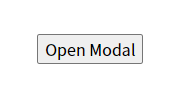
}完成例
こんなボタンができます↓
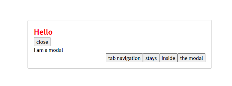
それをクリックすると、このようなモーダルが出ます。↓
あとは、ご自身で必要な形にアレンジするだけです!